Church Website Design Trends [2025]

Your church website isn’t just an online bulletin—it’s the digital front door to your ministry. In 2025, the best church websites are smarter, more interactive, and more engaging than ever.
Here are five big trends that can take your church website design from outdated to modern and impactful!
Interactive Forms
Gone are the days of boring, static church websites. Interactive Forms are just one way to do this!
Forms aren’t just for collecting information—they’re a way to build connections with people. In 2025, churches are moving beyond basic contact forms and embracing interactive form cards that make engagement quick, easy, and personal.
Instead of long, cluttered forms, churches are using:
- Prayer Request Forms: A dedicated form card where people can submit prayer requests anytime, ensuring they feel heard and supported.
- Connect With Us Cards: Digital connection cards for first-time visitors, making it easy to follow up and build relationships.
- Event Sign-Ups: Streamlined forms for small groups, classes, and volunteer opportunities.
These form cards integrate seamlessly into church websites, allowing members and visitors to engage from any device, anytime.
Member Portal
Your church website isn’t just for first-time visitors—it should also serve your congregation with an easy way to stay connected. In 2025, more churches are adding secure, interactive member portals that provide a personalized experience for regular attendees.
A member portal allows people to:
- Check in for events and services– Simplify attendance tracking and streamline event registration.
- Manage giving and donations– Make tithing easy with online giving history and recurring donation options.
- Access sermon archives and study materials– Provide a digital hub for past messages, Bible studies, and discipleship resources.
- Update personal info and preferences– Members can manage their contact details, ministry involvement, and communication settings.
A great member portal strengthens engagement by giving people a single place to interact with your church throughout the week—not just on Sundays!
Photo-Driven Design
Forget cheesy stock photos—people want to see real faces from your church. In 2025, churches are using high-quality, authentic photography to make their websites feel warm and welcoming.
Centralia Bible Baptist Church
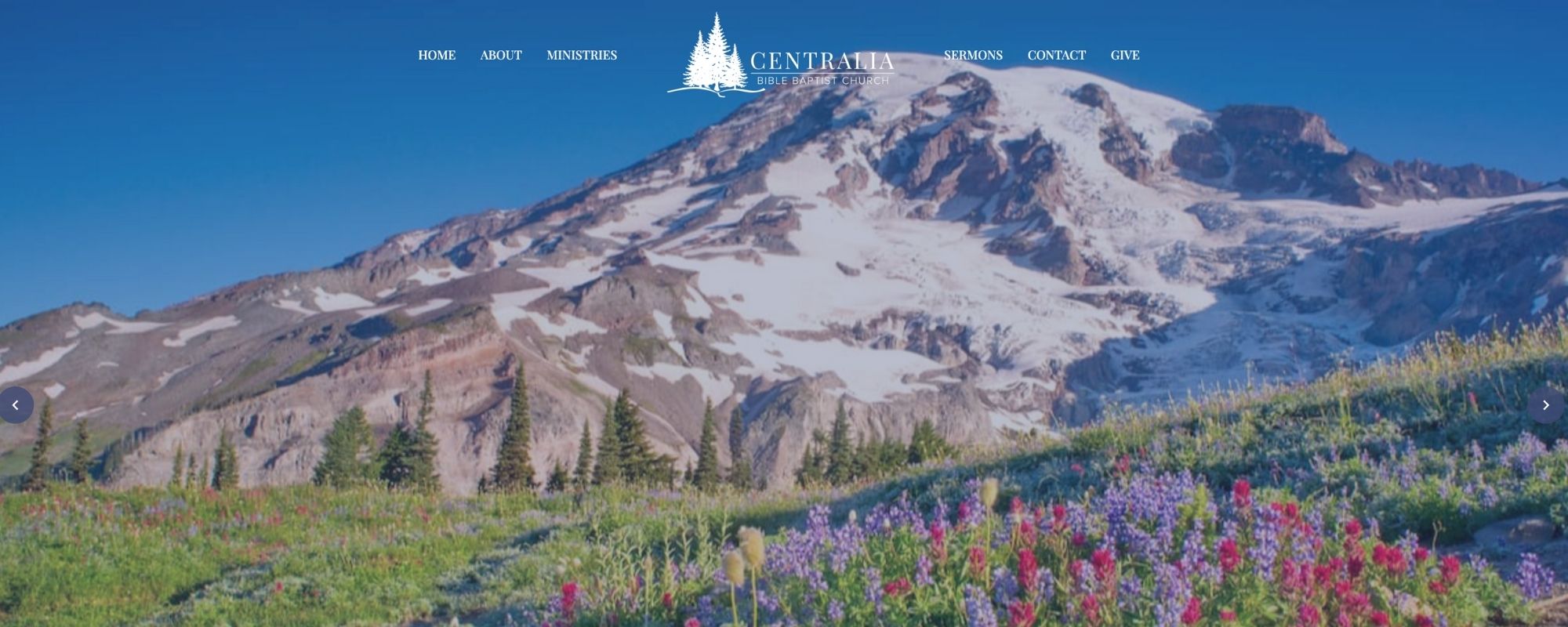
Website: https://centraliabbc.org/
Instead of staged, awkward images, churches are showcasing real people worshiping, serving, and building community. Large, full-screen imagery helps set the tone for the website, making a strong first impression. Some churches are even using subtle video backgrounds on their home pages to add a dynamic, engaging feel.
Minimalist and Modern Aesthetics
A clean, simple design makes your church website feel peaceful, organized, and easy to navigate. In 2025, less is definitely more.
Instead of overwhelming visitors with too much information at once, churches are opting for a more focused layout that helps people find exactly what they're looking for without distractions. Simple menus and clear buttons make it effortless to locate service times, ministries, and contact details. Many sites are also adding a dark mode option, giving visitors a sleek, eye-friendly alternative. This minimalist approach doesn’t just look good—it creates a stress-free experience that invites new visitors to stay longer and engage more with the content.
Bethel Reformed Presbyterian Church

Website: https://www.bethelrpc.com/
A minimalist approach helps visitors feel invited, not overwhelmed. Clarity = better engagement!
Collage-Style Designs
Inspired by ’80s album covers and scrapbook aesthetics, this artsy trend is popping up on church websites. It’s bold, expressive, and perfect for churches that want to stand out!
This collage-style design is perfect for churches that want to stand out with a fun, artistic vibe. Layered textures, such as torn paper effects, paint strokes, and overlapping images, add visual depth and personality. Hand-drawn illustrations and doodles bring a unique, personal touch, making the site feel more inviting. A mix of different fonts and styles adds to the dynamic, playful energy, keeping things fresh and visually engaging.
Fairhaven Church

Website: https://fairhaven.church/
This is a great option for churches with a creative vibe—youth ministries and outreach-focused churches will love this trend!
The Bottom Line: Keep Your Church Website Current!
Your website isn’t a set-it-and-forget-it kind of thing—it needs regular updates to stay effective.
Pro Tips to Manage Your Church Website
- Track Your Traffic: If you're not using Google Analytics or tracking your website traffic in some way, you're missing out.
- Update Content Often: Keep your homepage, sermon uploads, events, and ministry pages up to date.
- Test the User Experience: Browse your site on different devices (mobile devices especially!) and make sure it’s easy to navigate.
By keeping up with these trends, your church website can be an inviting, engaging space that helps your ministry grow and reach more people!